Watch Youtube Streams and Chat with React
In this tutorial I'm going to show you how to bootstrap a React project from scratch using NPM and Webpack, integrate Google Login, grab data from the Youtube API, and deploy your code to Netlify
We will be building an application that shows a list of active Youtube Live Streams and lets the user watch them.
Part 2 will include adding a custom serverless websocket based chat that your users can use to talk with one another while watching the videos.
The complete demo can be found here: TalkTV on Netlify
If you get an error saying the application is not authorized, I just didn't bother submitting it to Google for verification since it's a demo app. You can safely skip it.
The codebase can be found here: TalkTV on GitHub
Getting Started
First we need to create a new repository for our project, so head over to GitHub. Thanks to Microsoft we can now create free private repositories, so you can keep your code secret if you like.
My Github is about 70/30 private/public, which used to be just a ratio and now is pretty close to the actual quantity.

Once you're set up, click that green button in the top right and get the address to clone your repo to your local computer.

Now some people like to make a local repository on their computer with git init and then set the upstream path to point to GitHub — and that works, at least for people who learned how to do it that way.
I choose the easier method:
git clone https://github.com/JacobParis/talktv.gitWith your repository set up on your local machine, open it up in your IDE of choice and we're ready to start!
Install Dependencies
React can be a little tricky to get going if you aren't familiar with modern build tooling. CreateReactApp was created to solve this issue, but it's very opinionated and locks away a lot of useful configuration options. Gatsby and Next.js are two other popular options, but I'll walk you through setting up your own.
npm initInitializing npm will create a package.json file that will store a list of our dependencies and our build scripts.
When we install packages, the --save flag will make sure they get added under dependencies in the package.json file. If we do --save-dev instead, they'll be added under devDependencies.
Later, anyone using this repository can install all packages with a simple npm install
First we install React. npm i is shorthand for npm install
npm i --save react react-dom react-router-dom styled-componentsThen webpack, which we'll use to compile and bundle our project
npm i --save-dev webpack webpack-cliAnd Babel, which transforms the easy code we write into the complicated code that works on everyone's devices
npm i --save-dev babel-loader @babel/core @babel/preset-env @babel/preset-reactSome plugins to read our HTML and CSS
npm i --save-dev css-loader html-webpack-plugin mini-css-extract-pluginAnd a loader for our SCSS code (optional)
npm i --save-dev node-sass sass-loaderYou're also going to want to create a .gitignore file with the following line. This will stop git from tracking our packages as if they were our own code.
node_modulesConfiguring Webpack
There are a lot of resources out there for learning webpack, including this excellent article by David Gilbertson which taught me pretty much everything I know.
I've been carrying the same boilerplate webpack configuration file forward for a while now, so feel free to steal it here. Create a webpack.config.js file in your root directory and copy this code into it.
Building the app
To get started, we need some HTML and Javascript. We'll start with the most basic index.html file, which we'll place in an app directory to keep it separate from the configuration boilerplate.
<!DOCTYPE html>
<html>
  <head>
    <title>📺 Talk TV</title>
    <link
      href="https://fonts.googleapis.com/css?family=Montserrat&display=swap"
      rel="stylesheet"
    />
  </head>
  <body>
    <div id="root"></div>
  </body>
</html>
Check through Google Fonts and pick a font you like. They're all free for both commercial and non-commercial purposes. Replace the <link /> tag with one you're happy with, then create a new app/index.js file in the same directory.
This is where we start working with React, but we'll want to keep it as simple as possible for now. Our goal is to get something functional displayed on-screen before we start fleshing out the product.
import React from "react"
import ReactDOM from "react-dom"

function App() {
  return <h1> 📺 Talk TV</h1>
}

ReactDOM.render(<App />, document.getElementById("root"))
Head back to our package.json file and add a new build script. We'll be able to build our app with the command npm run build no matter what we change this script to be later. Right now it's not very important if you'd prefer to type npx webpack instead, but some of our later scripts are going to be more complicated and I prefer consistency across the board.
"scripts": {
    [...]
    "build": "npx webpack"
}
NPX is a utility by npm that lets you execute packages without installing them globally. If you run the command npm i -g webpack, it will add the webpack command to your PATH. While this normally won't cause any issues, it forces you to use the same version of webpack for every project on your machine. Using npx allows your project to remain agnostic of the machine it's running on.
Modify our .gitignore file to add our dist directory
dist
node_modules
Run our new build script and you should see a number of files appear inside the dist directory. If so, success! We're ready to test our site live.
npm run buildRunning Locally
If we open up our index.html file in a browser, everything should work fine for now, but routing won't work well later once we implement that. Luckily the team at Zeit has created the excellent serve package for spawning a quick webserver on our local machine.
We'll call it with the -s flag to hint that we're running a single page application, which will continue to serve our index.html file instead of giving us 404 errors.
Add a serve script to our package.json file and then run it.
"scripts": {
    [...]
    "serve": "npx serve -s dist"
}
npm run serveNavigate to localhost:5000 (or any other port you may have chosen) in your browser, and see what we see!

Running on Netlify (Optional)
Local is great for development, but there isn't much of a point building a site if nobody else gets to use it. I recommend Netlify a hundred times over for hosting static websites for free. When I started using it, it was the clear winner in the category. Nowadays, GitHub Pages is a very strong contender and is likely even easier to set up since you're already using GitHub for your repository.
I'll be using Netlify because it's great at what it does and it's what I'm used to.
Feel free to skip this section if you aren't interested in public hosting or if you want to set up on your own. Otherwise, head on over to Netlify and log in or sign up!

Create a new site from Git

Choose GitHub, or any other VCS provider you may be using

Give Netlify permission to access your code


Now every time you commit and push the changes you've made to your application, and Netlify will automatically start deploying them.


And once it's ready you can see it live at the URL

Create the Login Scene
Okay! So when a user gets to our site, they need to be prompted to log in. We can map that flow with a simple flowchart like this
Arrives on Site:
  - Is logged in:
      Show Gallery Scene
  - Is not logged in:
      Show Login Scene:
        - Prompt for login
        - If successful, refresh
```  numbered

By refreshing after login, we avoid setting up any duplicate routing commands. The user simply goes through the normal flow a second time with the access to get to the right place.

The minimal implementation here is an `isLoggedIn` state that will show either scene. We don't even need to implement the login yet. One thing at a time.

Create a `scenes` folder and a `login.js` file inside. This will be a super simple scene to start.

```jsx numbered
import React from "react";

 export default function() {
    return (
        <h1> Please log in! </h1>
    );
}
And then back in our index.js we import the scene and set our state
import LoginScene from "./scenes/login"

function App() {
  const isSignedIn = false

  return isSignedIn ? <h1> 📺 Talk TV</h1> : <LoginScene />
}
Rebuild, and the app should greet you with our new scene!

Test by changing isSignedIn to true and see if you get the old homepage. That means everything is working so far!
Start building our UI
You can follow this section as loosely as you want — it's your app to make look however you want. Functionally the next thing we need to do is implement the actual google authentication, but for that we need a button. And if we're making buttons already, we might as well make them look nice.
Make a new folder to store our components. These will be reusable combinations of HTML and CSS, so we avoid a lot of rewritten code. I like Styled Components for this because it shoves your own code reuse in your face. You become very encouraged to use the same components again rather than making another one that's almost identical.
In components/containers.js add this code:
import styled from "styled-components"

export const Container = styled.div`
  padding: 2rem;
  display: flex;
  justify-content: center;
`
This is a small flex container that will center any elements placed within it. We'll wrap our Login scene text with it
import { Container } from "~/components/containers.tsx"

export default function () {
  return (
    <Container>
      <h1> Please log in! </h1>
    </Container>
  )
}
If you rebuild you should see some center aligned text!
Change the font
But Times New Roman is ugly, so it's time to set our actual font. If you'll remember our index.html file has a Google Font import in the header for Montserrat. If you used a different font you'll want to do that here too.
Beside our index.html and index.js files lets make an index.scss file. This will hold our global application styles that we don't want to leave up to the component.
html {
  font-family: "Montserrat", sans-serif;
}

body {
  margin: 0;
}
And then at the very top of our index.js we need to import it.
import "./index.scss"It might seem weird to import a CSS file, but this import is how webpack is able to find it and process it into regular CSS. Webpack starts at our entry point (index.js) and then branches through every import in every file connected to it.
Create a card component
Having styled text in the center of your screen works for a very minimalist aesthetic, but I'm feeling more fond of a dedicated card to greet our new users. Add a new component called cards.js
import styled from "styled-components"

export const Card = styled.div`
  color: #333;
  background-color: #fff;
  border: 1px solid black;
  border-radius: 0.5rem;
  padding: 1.5rem;
  width: 90%;
  max-width: 300px;
  text-align: center;
`
Here we have a container with a nice border, rounded edges, centered text and it grows to 90% of its parent width to a maximum of 300px. On really narrow devices, like portrait smartphones, this gives us a nice 5% margin on either side.
I was playing around here for a little bit and I also decided to add two more components in the same file
A subtle dividing line for our card
export const Divider = styled.hr`
  width: 50%;
  opacity: 0.2;
  margin-bottom: 2rem;
  margin-top: 0;
`
And a large icon for our logo, which is just an emoji
export const Icon = styled.p`
  font-size: 10rem;
  margin: 0;
  user-select: none;
`
Go back to our login.js and replace our please log in plea with our new components.
import { Card, Divider, Icon } from "~/components/cards.tsx"
export default function () {
return (
<Container>
<LoginCard />
</Container>
)
}
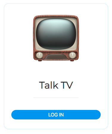
function LoginCard() {
return (
<Card>
<header>
<Icon>📺</Icon>
<h1>Talk TV</h1>
</header>
<Divider />
<div>PLEASE LOG IN</div>
</Card>
)
}You could easily just add the LoginCard contents directly in our Container, but I like to separate distinct components as much as I can. If you run it, your site should be looking almost like this. I actually forgot to take a screenshot here so I'm a bit ahead of you.

The biggest change I think should be the blue border, which we'll handle now.
Adding a theme config file
When you reuse the same colours, styles, and sizes throughout your app, it can be hard to keep them consistent if you change them all later. Luckily, Styled Components makes it really easy to keep a central store of our application styling.
Create a new file called app/theme.js next to our index files, and add some basic styles to it
export default {
  background: "#ffffff",
  baseFontColor: "#000000",
  baseFontSize: "16px",
  baseRadius: "1rem",
  primary: "#2196f3", // MD Light Blue 500
}
Back in our card component, we can access the Theme file like any other bit of javascript
import Theme from "../theme"And then replace our border styles with this
border-radius: ${props => Theme.baseRadius};
border: ${props => `1px solid ${Theme.primary}33`};
The argument to that function is called props because Styled Components lets us access the props in our styles. We don't need that right now, so you can replace it with () => or _ => like people often do when they don't need arguments.
If you rebuild, you should be looking like my last screenshot there now!
Adding a Login button
Now we still don't have an actual clickable button, so we'll want to create a new components/button.js file. Buttons are some of the most versatile components out there, so instead of building one from scratch I stole a component from a previous project which I will provide for you to steal also!
Here I make significant use of the props argument I mentioned above, for example in this line:
cursor: ${props => props.disabled ? "not-allowed" : "pointer"};And you can trigger that by adding the prop attribute.
<button disabled>NOT ALLOWED</button>In our login.js file, once again replace our please log in text with a component. It might seem odd to do everything in little bite sized steps like this, but using text placeholders for components solves the problem that every part of our app is going to depend on something else downstream.
It's better to focus on getting one dependency working at a time and then moving on to build the next step.
import { Button } from "~/components/button.tsx";
function LoginCard() {
return (
<Card>
<header>
<Icon>📺</Icon>
<h1>Talk TV</h1>
</header>
<Divider />
<Button primary>LOG IN</Button>
</Card>
);
}
``` numbered
And now we have a button!
## Google Authentication
With our button in place to change our `isLoggedIn` state and the mechanics to change our route based on the state, all that's left to do is tie them together by integrating Google auth. It isn't too difficult but it can be tough to navigate the docs and API Console and get where you need to be.
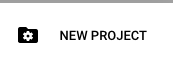
Head on over to the [Google API Console](https://console.developers.google.com/apis/dashboard) and click the New Project button in the top left
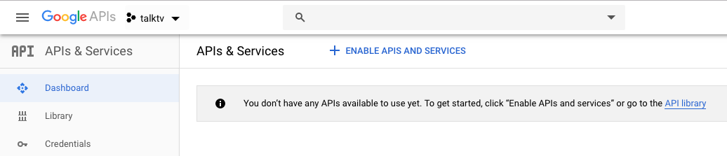
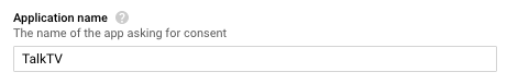
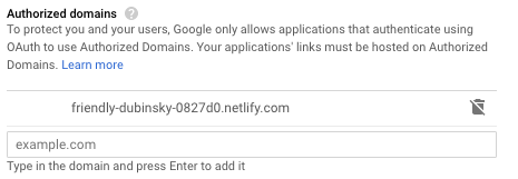
Once your project is created, go to **OAuth Consent Screen** in the left sidebar and set our Application Name and Authorized domain.
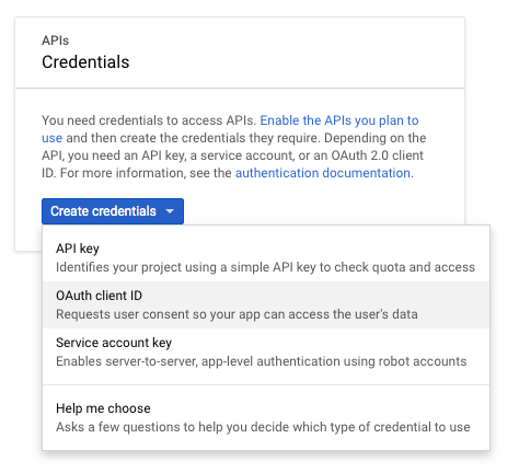
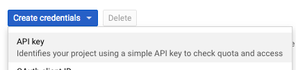
We're going to need two sets of keys. In order to log in, we will need oAuth2 keys. In order to pull data from the Youtube API, we will need an API key. Go to **Credentials** -> **Create Credentials** -> **OAuth Client** ID
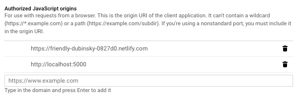
Select **Web Application**, put in our application name again and then add our javascript origins. Google will reject requests that don't come from a verified origin. We'll want to add both our Netlify URL and our localhost origin for development.
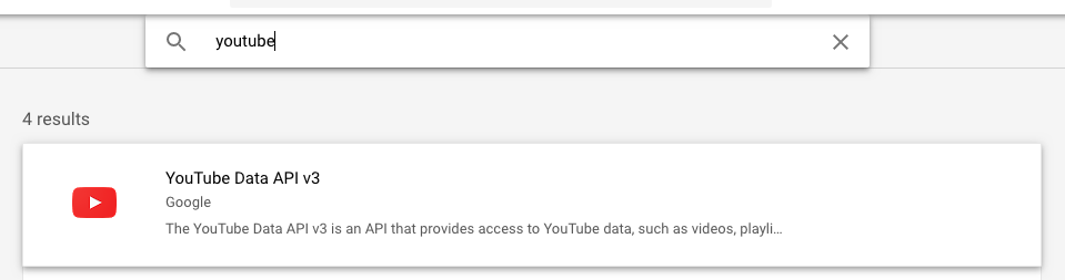
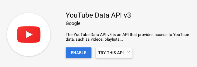
Now in **Dashboard** -> **Enable APIs and Services** search for the Youtube Data API
Add a new API Key. We'll use this to connect to the Youtube API.
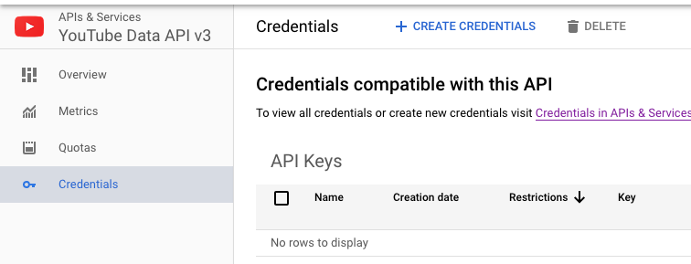
If you head back to **Credentials**, you can see both our API Key and our Client ID ready to go
## Integrating into the app
In order to connect to the Google API, we need to import the Google JS API into our project. There are a number of ways to do this but the easiest by far is to simply include it in the `<head>` tag of our `index.html` file at the root of our app.
```html numbered
<head>
<title>📺 Talk TV</title>
<link href="https://fonts.googleapis.com/css?family=Montserrat&display=swap" rel="stylesheet">
<script src="https://apis.google.com/js/api.js"></script>
</head>Next we need to add our keys to our index.js file. I like to keep these constants just above the main App declaration.
const CLIENT_ID = ASDFASDFASDFASDF;
const API_KEY = QWERQWERQWERQWER;

function App() {
Before we can use the Google API, we need to initialize it. One way to do this would be to check its status before each method call, and if needed initialize first, but that is a lot of unnecessary checking.
Due to the way React works, we can track its ready status in a state, and choose to only render the app when Google is ready. None of our child components can call the API unless they're rendered, so we shouldn't run into issues.
When we included the API into our <head> tag, it exposed the global keyword gapi to all of our javascript files, and we'll use that to interact with it.
In our index.js make a new function called Preloader and change the ReactDOM render method at the bottom of the file to call the preloader instead.
function Preloader() {
  const [isGoogleReady, setGoogleReady] =
    React.useState(false)

  return isGoogleReady ? <App /> : <div>Loading...</div>
}

ReactDOM.render(
  <Preloader />,
  document.getElementById("root"),
)
By switching isGoogleReady from true to false you will see either the app or the loading screen.
Since the google API is outside of our component, we'll want to wrap the code that interacts with it inside a useEffect hook. We initialize the API and then set our state when it's ready
React.useEffect(() => {
  const authPromise = gapi.auth2.init({
    clientId: CLIENT_ID,
  })

  authPromise.then(() => {
    setGoogleReady(true)
  })
}, [])

return isGoogleReady ? <App /> : <div>Loading...</div>
If you run this now, you should see the Loading screen appear briefly before the main app does. If so, great! But there are still two issues with our code.
The first is that sometimes our component will load for the first time and the Google API could already be initialized. If that's the case, we don't need to redo it.
We can test for this by the presence of the auth2 field in the gapi object. Update our initial state declaration with the following:
const wasGoogleReady = !!gapi.auth2
const [isGoogleReady, setGoogleReady] =
  React.useState(wasGoogleReady)
The second issue is that by the time we finish initializing, our component might have re-rendered already. When a component re-renders, it's a completely new function in a new context that can't use our old state variables, so trying to set them will cause an error. React has very descriptive errors that will let you know exactly when this is the case, we can solve it now anyway.
The useEffect hook supports a return argument of a second function to return when the component unmounts. This lets us clean up any unfinished business, but in particular we'll use it here to break our promise.
React.useEffect(() => {
  const isSubscribed = true

  const authPromise = gapi.auth2.init({
    clientId: CLIENT_ID,
  })

  authPromise.then(() => {
    if (isSubscribed) setGoogleReady(true)
  })

  return () => (isSubscribed = false)
}, [])
We track a variable that remembers if we are still subscribed to the result of this promise. If not, we just don't anything with the results.
Wiring up the Login Button
In login.js, I decided to make a new hook just to reduce the verbosity of the gapi declaration. This is entirely optional but I think it makes for some cleaner code.
function useAuth() {
  return gapi.auth2.getAuthInstance()
}
We'll now make a callback to trigger a sign in attempt and pass it down to our button
export default function () {
  const onLogin = React.useCallback(
    () => useAuth().signIn(),
    [],
  )

  return (
    <Container>
      <LoginCard onLogin={onLogin} />
    </Container>
  )
}
And we'll grab the prop in our arguments and pass down to the button
function LoginCard({ onLogin }) {
  return (
    <Card>
      <header>
        <Icon>📺</Icon>
        <h1>Talk TV</h1>
      </header>
      <Divider />
      <Button primary onClick={onLogin}>
        LOG IN
      </Button>
    </Card>
  )
}
Now if we rebuild and click our button, we should be passed through Google Auth

And then once we log in, refresh the page and it should now take us through the flow to our homepage

Perfect! One last thing — we should make it automatically refresh after logging in. Replace your onLogin callback with this
const onLogin = React.useCallback(
  () =>
    useAuth()
      .signIn()
      .then(() => {
        // Refresh after sign-in
        location.reload()
      }),
  [],
)
Adding a header
We won't be able to test the login refresh properly until we have a sign out button, so next we'll build a header component that includes one.
Make a new file called app/components/header.js and add a basic layout.
import React from "react"
import styled from "styled-components"

const Container = styled.div`
  display: flex;
  justify-content: center;
  position: relative;
`

const HeaderText = styled.h1`
  margin: 0.25rem 0;
`

export function Header() {
  return (
    <Container>
      <HeaderText> 📺 Talk TV </HeaderText>
    </Container>
  )
}
and then add it to our home.js
import { Header } from "~/components/header.tsx"

export default function () {
  return (
    <div>
      <Header />
      <h1> Welcome home, logged in user!</h1>
    </div>
  )
}
I didn't take a screenshot before I added the Sign Out button, but we should be pretty close to this now.

The Sign Out Button
Back in our header.js component add an actions section for our button and implement a callback. This should be pretty familiar, since it's more or less the same code for our login button back in home.js.
import { Button } from "../components/button"

const HeaderActions = styled.div`
  position: absolute;
  right: 1rem;
  top: 0.25rem;
  bottom: 0;
`

function SignoutButton() {
  const signOut = React.useCallback(
    () =>
      useAuth()
        .signOut()
        .then(() => {
          // Refresh after signout
          location.reload()
        }),
    [],
  )

  return (
    <Button inverted onClick={signOut}>
      Sign Out
    </Button>
  )
}

function useAuth() {
  return gapi.auth2.getAuthInstance()
}
And then we'll add it to our render return
export function Header() {
  return (
    <Container>
      <HeaderText> 📺 Talk TV </HeaderText>
      <HeaderActions>
        <SignoutButton />
      </HeaderActions>
    </Container>
  )
}
Now if you rebuild it should look like that last screenshot. Click the sign-out button and you should end up on the login scene, ready to log back in without needing to refresh.
Loading...
It's painfully obvious how ugly our loading spinner is, so now is a good time to upgrade it. Luckily the React community has created a number of packages we can use.
Install the react-loader-spinner package
npm i --save react-loader-spinnerand make a new component called loading.js
import React from "react"
import { Container } from "./containers"
import Loader from "react-loader-spinner"
import Theme from "../theme"

export function Loading() {
  return (
    <Container>
      <Loader
        type="Bars"
        color={Theme.primary}
        height={100}
        width={100}
      />
    </Container>
  )
}
Add it to our index.js where our loading text used to be
import { Loading } from "./components/loading.tsx"return isGoogleReady ? <App /> : <Loading />
Implementing the Youtube API
Our authentication flow is complete, which means our next step is to start pulling data in from youtube. We don't actually have permission to access anything yet since we didn't request it on login, so we'll fix that first.
Near the top of your login.js file add a constant declaring which scope we want to use. This is a set of permissions that we'll let the user consent to on sign-in.
const YOUTUBE_SCOPE =
  "https://www.googleapis.com/auth/youtube.readonly"
and then update the sign in function to use it
const onLogin = React.useCallback(() => useAuth().signIn({
    scope: YOUTUBE_SCOPE
}).then(() => {
Log out and back in and it'll ask to get some basic read only permissions to your Youtube account.
Head over to home.js and we'll request a list of live videos from the youtube API. I'm always pretty heavy on the console.logs when adding new code, especially when it comes to an API I've never used before. Add this to the bottom of the file
function getVideos() {
  return new Promise((resolve, reject) => {
    gapi.client.youtube.search
      .list({
        part: "snippet",
        eventType: "live",
        maxResults: 12,
        q: "game",
        type: "video",
      })
      .then((response) => {
        console.log("GET VIDEOS", response)
        const items = response.result.items

        if (items) {
          resolve(items)
        } else {
          reject()
        }
      })
      .catch((error) => {
        console.log("ERROR VIDEOS", error)
        reject()
      })
  })
}
and then implement it with our same subscribed effect pattern we used earlier
export default function() {
    React.useEffect(() => {
        let isSubscribed = true;

        getVideos().then(videos => {
            if (isSubscribed) {
                console.log(videos);
            }
        });

        return () => isSubscribed = false;
    }, []);
Run that and check your log to see if you get an array of videos. If so, great! If you don't update the login scope (like I forgot to the first time) then you'll get this error

Displaying the Videos
You can design this part any way you want, but I'll just go through the way I built mine step by step
Make a new component called app/components/youtube.js
First we'll need a container to hold them. I'm going to use Flex, but Grid is another viable option. I'm choosing flex because we don't need to structure the elements in specific rows and columns.
If we just used inline-block elements, we could run out a long line of videos that'd wrap to the next line and work perfectly on every resolution. Flex lets us do the same thing, but also expand each element to take up empty space.
All of these will be going into the same file.
import styled from "styled-components"

export const BoxGrid = styled.ul`
  display: flex;
  flex-wrap: wrap;
  padding: 1rem;
`
We'll want a clickable container for each video thumbnail. It's possible to add a click listener on the element, but then we need to add our own tab index and it's easier to just use elements designed for navigation. Like links.
import { Link } from "react-router-dom"
import Theme from "../theme"

const Container = styled(Link)`
  max-width: 100%;
  flex: 1 0 280px;
  border-radius: ${(props) => Theme.baseRadius};
  margin: ${(props) => Theme.baseRadius};
  position: relative;
`
Each thumbnail will need an image
const Thumbnail = styled.img`
  width: 100%;
  border-radius: ${(props) => Theme.baseRadius};
  border: ${(props) => `1px solid ${Theme.primary}33`};
`
And below each thumbnail we want to be able to display the title and a watch now button
import { Button } from "./button"

const Details = styled.div`
  padding: 0.5rem;
  flex: 0;
  justify-content: space-between;
  align-items: center;
  display: flex;
`

const Title = styled.span`
  font-weight: bold;
`

const Action = styled(Button)`
  flex: 0;
`
Then we put them together in a component
function YoutubeThumbnail({ id, thumbnail, title }) {
  return (
    <Container to={`/watch/${id}`}>
      <Thumbnail src={thumbnail.url} />
      <Details>
        <Title>{title}</Title>
        <Action inverted>WATCH</Action>
      </Details>
    </Container>
  )
}
Finally, we'll want to export an array of our thumbnails based on the data we got from the API
import { Loading } from "./loading"

export function YoutubeGallery({ videos }) {
  const hasVideos = videos && videos.length

  return hasVideos ? (
    videos.map((video) => (
      <YoutubeThumbnail
        id={video.id.videoId}
        thumbnail={video.snippet.thumbnails.medium}
        title={video.snippet.channelTitle}
      />
    ))
  ) : (
    <Loading wide />
  )
}
In our Home scene, we'll import these components and update our effect to put the API data into state
import {
  BoxGrid,
  YoutubeGallery,
} from "~/components/youtube.tsx"

export default function () {
  const [videos, setVideos] = React.useState([])

  React.useEffect(() => {
    let isSubscribed = true

    getVideos().then((videos) => {
      if (isSubscribed) setVideos(videos)
    })

    return () => (isSubscribed = false)
  })

  return (
    <div>
      <Header />
      <BoxGrid>
        <YoutubeGallery videos={videos} />
      </BoxGrid>
    </div>
  )
}
Which should look like this when you're all done

The Watch Scene
If you're paying close attention, you'll notice that each thumbnail now links to /watch/${id}
That route doesn't exist yet, but it's about to.
Add a new file in scenes/watch.js and give it a basic component so we can test our routing
import React from "react"

export default function () {
  return <span>Watch Scene!</span>
}
And then add it to our route definitions in index.js
import WatchScene from "./scenes/watch"<Switch>
<Route path="/watch/:id" component={WatchScene} />
<Route path="/watch" component={HomeScene} />
<Redirect from="/" to="/watch" />
</Switch>Clicking on any of our thumbnails should give us this now

Lets give our components/youtube.js file one more export
export const VideoFrame = styled.iframe.attrs(({ id }) => ({
  width: 560,
  height: 349,
  frameborder: "0",
  allowFullScreen: true,
  src: getEmbedURL(id),
}))`
  border-radius: ${(props) => Theme.baseRadius};
  border: ${(props) => `1px solid ${Theme.primary}33`};
`

function getEmbedURL(channelId) {
  return `https://www.youtube.com/embed/${channelId}`
}
and then add it to our watch scene to complete this half of the project
import { Header } from "~/components/header.tsx"
import { Container } from "~/components/containers.tsx"
import { VideoFrame } from "~/components/youtube.tsx"

export default function () {
  const channelId = document.location.pathname
    .split("/")
    .pop()

  return (
    <div>
      <Header />
      <Container>
        <VideoFrame id={channelId} />
      </Container>
    </div>
  )
}
Conclusion
In this tutorial, we've built an application that lets a user log in with their google account, view a list of active live streams, and choose one to watch
In part 2 we'll build our own chat system that the users of your site can use to communicate while watching the videos
The demo for the completed product can be found here: Talk TV on Netlify